
SEREN
Guiding Returning Users to Build Consistent Meditation Habits

SEREN
Guiding Returning Users to Build Consistent Meditation Habits
How did I turn research into actionable insights?
A UX case study focused on improving retention through guided experiences and progress-based motivation
Seren is a concept meditation app designed to improve user retention by helping returning users stay consistent with their practice.
Rather than focusing on content creation, this project addresses a key behavioral challenge: users often drop off because they lack clear direction and motivation to continue.
The solution focuses on guiding users toward a next action and reinforcing their progress through a structured, personalized experience.

What is Seren?
A UX case study focused on improving retention through guided experiences and progress-based motivation
Seren is a concept meditation app designed to improve user retention by helping returning users stay consistent with their practice.
Rather than focusing on content creation, this project addresses a key behavioral challenge: users often drop off because they lack clear direction and motivation to continue.
The solution focuses on guiding users toward a next action and reinforcing their progress through a structured, personalized experience.
Project Overview
Duration
2 Months
team
Group of 3
Role
UX/UI Designer
Tools
Figma, Illustrator, Maze
Duration
2 Months
Role
UX/UI Designer
team
Group of 3
Tools
Figma, Illustrator
What problem am I solving?
Returning users drop off because they don’t know what to do next and feel overwhelmed by too many options.
Users often start with the intention to build a meditation habit, but struggle to maintain consistency over time.
Through early interviews, users expressed difficulty maintaining routines and frequently abandoned sessions after initial engagement.
The core issue was not a lack of content, but a lack of clear direction, combined with overwhelming choices and complex interfaces.
What goals am I trying to achieve?
Help returning users stay consistent by guiding their next action and reinforcing their progress.
the goal is to improve user retention by reducing decision friction and supportng consistent begavior.
Instead of expanding content, the focus is on guiding users toward a clear next step and creating a sense of progress and achievement.
The experience is designed to be calm, minimal, and focused, helping users stay engaged without feeling overwhelmed.
What problem am I solving?
Returning users drop off because they don’t know what to do next and feel overwhelmed by too many options.
Users often start with the intention to build a meditation habit, but struggle to maintain consistency over time.
Through early interviews, users expressed difficulty maintaining routines and frequently abandoned sessions after initial engagement.
The core issue was not a lack of content, but a lack of clear direction, combined with overwhelming choices and complex interfaces.
What goals am I trying to achieve?
Help returning users stay consistent by guiding their next action and reinforcing their progress.
the goal is to improve user retention by reducing decision friction and supportng consistent begavior.
Instead of expanding content, the focus is on guiding users toward a clear next step and creating a sense of progress and achievement.
The experience is designed to be calm, minimal, and focused, helping users stay engaged without feeling overwhelmed.
What did I learn from user behavior and reviews?
Users drop off not because of lack of content, but due to lack of guidance and visible progress.
To understand why users fail to stay consistent, I conducted secondary research, user interviews, and analyzed 200+ user reviews from Google Play, App Store, and Reddit.
Across all sources, a clear pattern emerged:
users don’t struggle to start, they struggle to continue without direction.
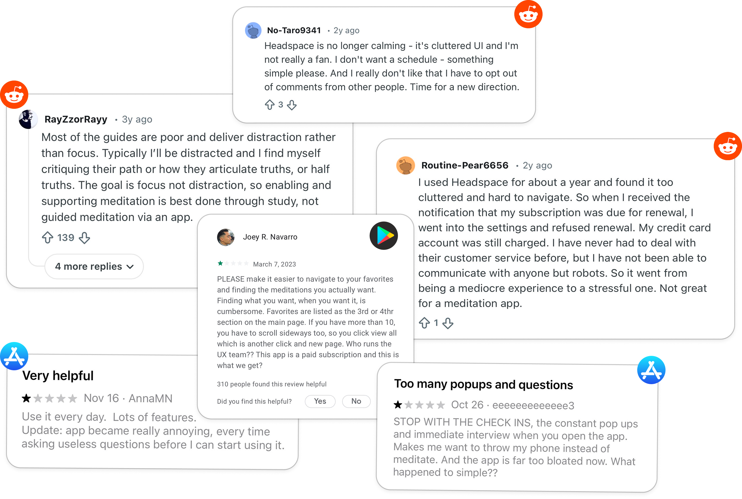
Key Takeaways from Secondary Research
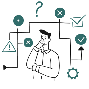
Too many choices create friction, not freedom
Users feel overwhelmed when faced with multiple options, leading to hesitation and drop-off.

Lack of visible progress reduces motivation
Returning users struggle to stay consistent because they can’t easily see their progress.
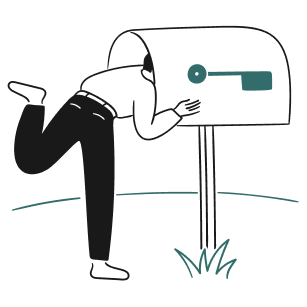
Users return for relevance, not variety
More content doesn’t increase engagement, personal relevance does.
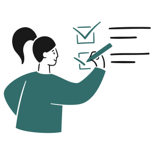
Starting is easy, continuing is the real challenge
Initial engagement is high, but long-term retention drops without support.
How did I turn research into actionable insights?
Users drop off not because of lack of content, but due to lack of guidance and visible progress.
To understand why users fail to stay consistent, I conducted secondary research, user interviews, and analyzed 200+ user reviews from Google Play, App Store, and Reddit.
Across all sources, a clear pattern emerged:
users don’t struggle to start, they struggle to continue without direction.
Key Takeaways from Secondary Research
Too many choices create friction, not freedom
Users feel overwhelmed when faced with multiple options, leading to hesitation and drop-off.
Lack of visible progress reduces motivation
Returning users struggle to stay consistent because they can’t easily see their progress.
Users return for relevance, not variety
More content doesn’t increase engagement, personal relevance does.
Starting is easy, continuing is the real challenge
Initial engagement is high, but long-term retention drops without support.
How did I turn research into actionable insights?
Existing meditation apps offer rich content but often overwhelm users and lack clear guidance.
I analyzed leading meditation apps including Calm, Insight Timer, and Oak to understand how existing products support user engagement and retention.
While these apps provide a wide range of content and features, they often rely on exploration rather than guidance, which can create friction for returning users.

Calm highlights the value of personalization, but its structured content can feel repetitive over time.
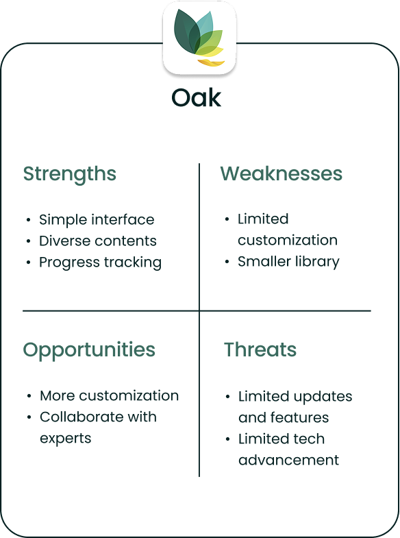
Oak’s simplicity makes the experience approachable, but limited customization reduces long-term engagement.
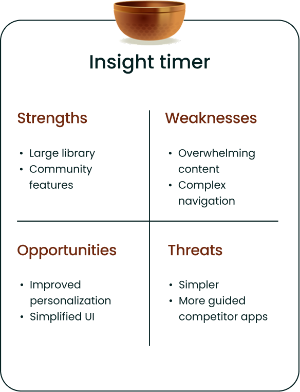
Insight Timer offers a large content library, but its complexity can overwhelm users and slow decision-making.
What can I learn from existing products?
Existing meditation apps offer rich content but often overwhelm users and lack clear guidance.
I analyzed leading meditation apps including Calm, Insight Timer, and Oak to understand how existing products support user engagement and retention.
While these apps provide a wide range of content and features, they often rely on exploration rather than guidance, which can create friction for returning users.
Calm highlights the value of personalization, but its structured content can feel repetitive over time.
Oak’s simplicity makes the experience approachable, but limited customization reduces long-term engagement.
Insight Timer offers a large content library, but its complexity can overwhelm users and slow decision-making.
How did I turn research into actionable insights?
Users want simplicity, guidance, and flexibility, not more features.
I conducted interviews with 6 participants who regularly use meditation apps to understand their behaviors, motivations, and challenges.
The goal was to uncover why users struggle to stay consistent and what helps them continue their practice.

“I like having different meditation styles to choose from. It keeps my practice interesting and tailored to my needs.”
Users value flexibility, but too many options without guidance can create confusion.

“I prefer an app that’s straightforward. Too many features can be overwhelming, so a clean design really stands out.”
Simplicity is critical for reducing friction and helping users stay consistent.
Key Takeaways from Interviews

Users need flexibility, but too many options without guidance lead to decision fatigue.

A simple interface is essential for reducing friction and supporting consistency.

Motivation comes from progress and reinforcement, not just gamification features.
What did users actually need?
Users want simplicity, guidance, and flexibility, not more features.
I conducted interviews with 6 participants who regularly use meditation apps to understand their behaviors, motivations, and challenges.
The goal was to uncover why users struggle to stay consistent and what helps them continue their practice.
“I like having different meditation styles to choose from. It keeps my practice interesting and tailored to my needs.”
Users value flexibility, but too many options without guidance can create confusion.
“I prefer an app that’s straightforward. Too many features can be overwhelming, so a clean design really stands out.”
Simplicity is critical for reducing friction and helping users stay consistent.
Key Takeaways from Interviews
Users need flexibility, but too many options without guidance lead to decision fatigue.
A simple interface is essential for reducing friction and supporting consistency.
Motivation comes from progress and reinforcement, not just gamification features.
How did I turn research into actionable insights?
Users need clarity, motivation, and personalization to stay consistent – not more features.
I synthesized findings from interviews and research by grouping recurring patterns into key themes. These insights helped define the core user needs and guided design decisions.
Users struggle with consistency, not starting
Users often begin meditation but fail to maintain the habit due to lack of structure and motivation. They need support in continuing, not just starting.

Too many options create friction instead of engagement
Large content libraries and multiple choices overwhelm users, making it harder to decide what to do next. Users benefit from guided experiences rather than open exploration.
Motivation comes from visible progress and reinforcement
Users feel encouraged when they can track their progress and see improvement over time. Without feedback, engagement drops.



Personalization increases relevance and emotional connection
Users want experiences that adapt to their mood, goals, and available time. Generic content reduces engagement and feels impersonal.

Simplicity is essential for reducing cognitive load
Users prefer clean, easy-to-navigate interfaces that help them focus rather than distract them.
How did I turn research into actionable insights?
Users need clarity, motivation, and personalization to stay consistent – not more features.
I synthesized findings from interviews and research by grouping recurring patterns into key themes. These insights helped define the core user needs and guided design decisions.
Users struggle with consistency, not starting.
Users often begin meditation but fail to maintain the habit due to lack of structure and motivation. They need support in continuing, not just starting.
Too many options create friction instead of engagement.
Large content libraries and multiple choices overwhelm users, making it harder to decide what to do next. Users benefit from guided experiences rather than open exploration.
Motivation comes from visible progress and reinforcement.
Users feel encouraged when they can track their progress and see improvement over time. Without feedback, engagement drops.
Personalization increases relevance and emotional connection.
Users want experiences that adapt to their mood, goals, and available time. Generic content reduces engagement and feels impersonal.
Simplicity is essential for reducing cognitive load.
Users prefer clean, easy-to-navigate interfaces that help them focus rather than distract them.
How did I turn research into actionable insights?
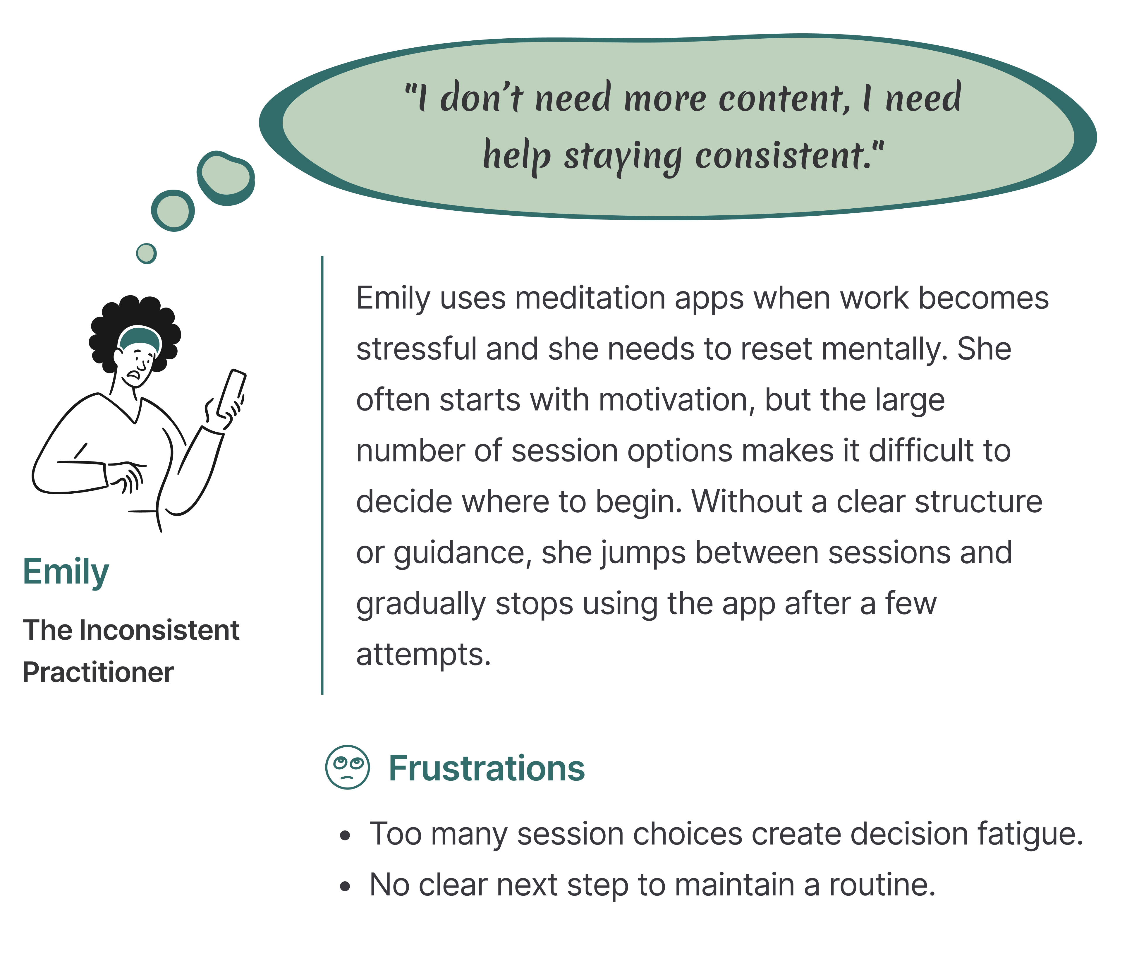
Meet Emily: A busy user who wants to stay consistent but struggles to maintain the habit.
This persona represents returning users who have already tried meditation but struggle to stay consistent over time.
Who are we designing for?
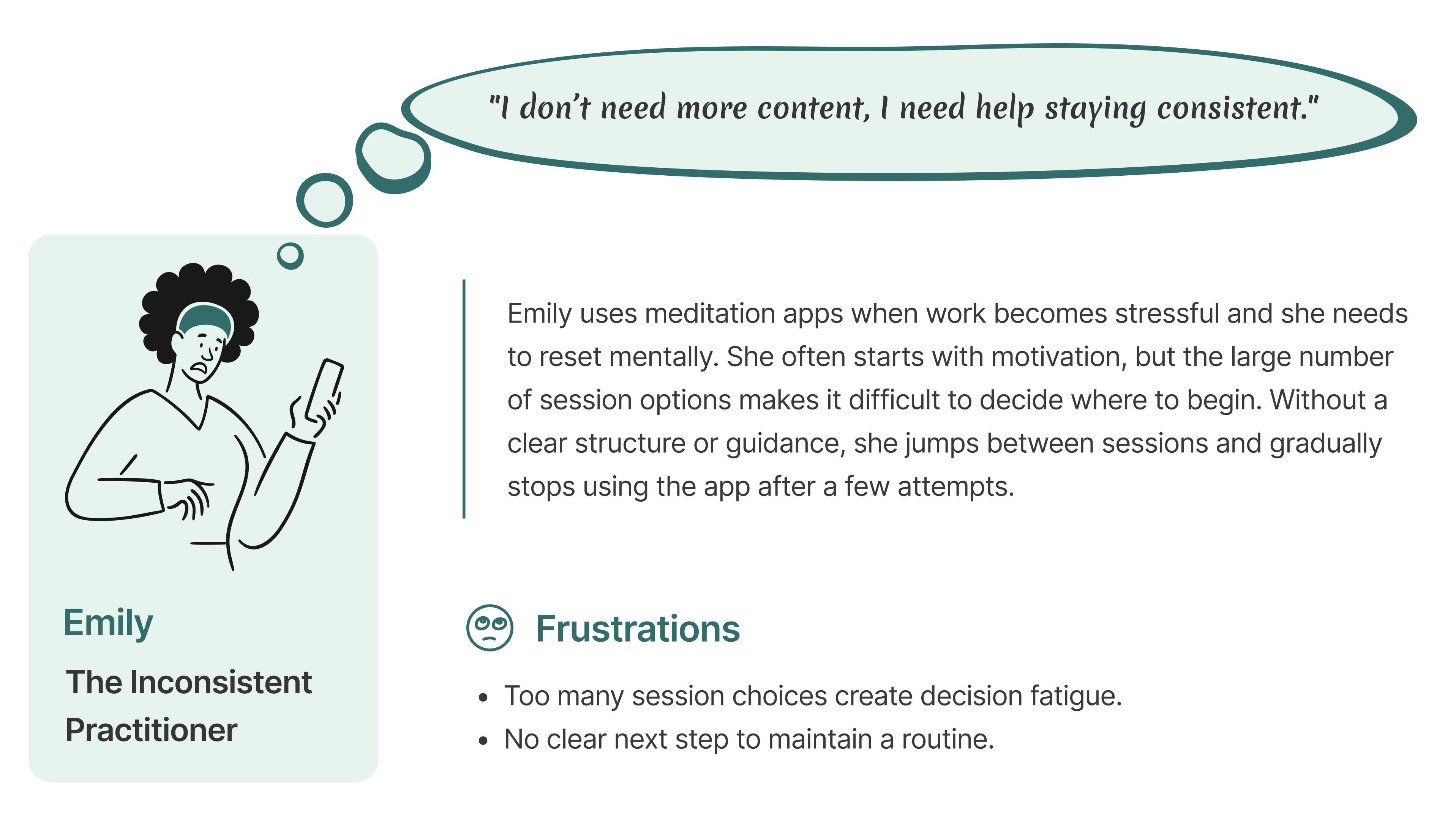
Meet Emily: A busy user who wants to stay consistent but struggles to maintain the habit.
This persona represents returning users who have already tried meditation but struggle to stay consistent over time.
How are we framing design opportunities with “How Might We” statements?
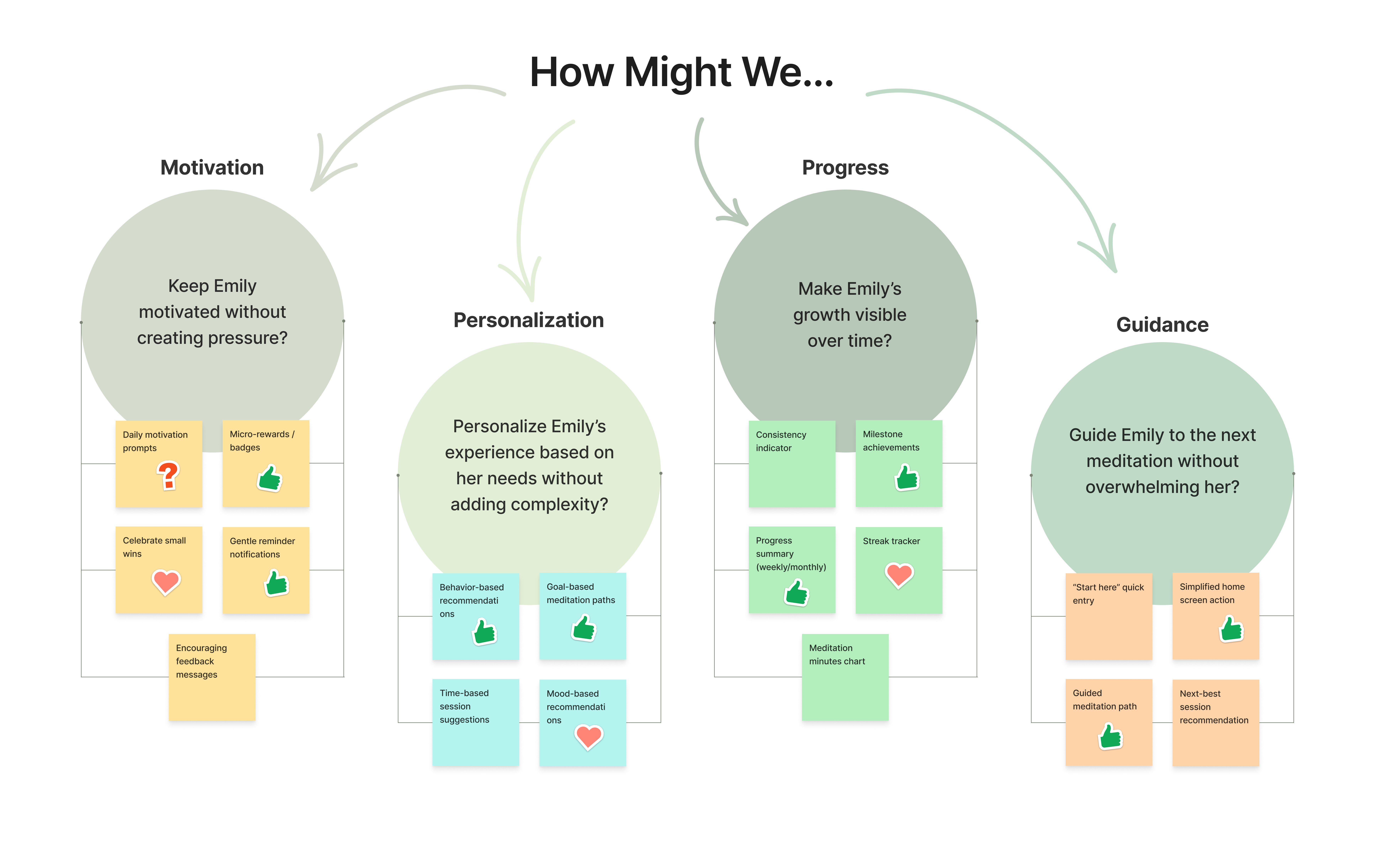
Research revealed a clear pattern: Users don’t struggle to start meditation, they struggle to stay consistent.
To transform these insights into actionable design directions, I reframed the main pain points as How Might We questions.
This helped shift the focus from problems to opportunities and guided the ideation process toward solutions that reduce overwhelm and support long-term engagement.
How did I turn research into actionable insights?
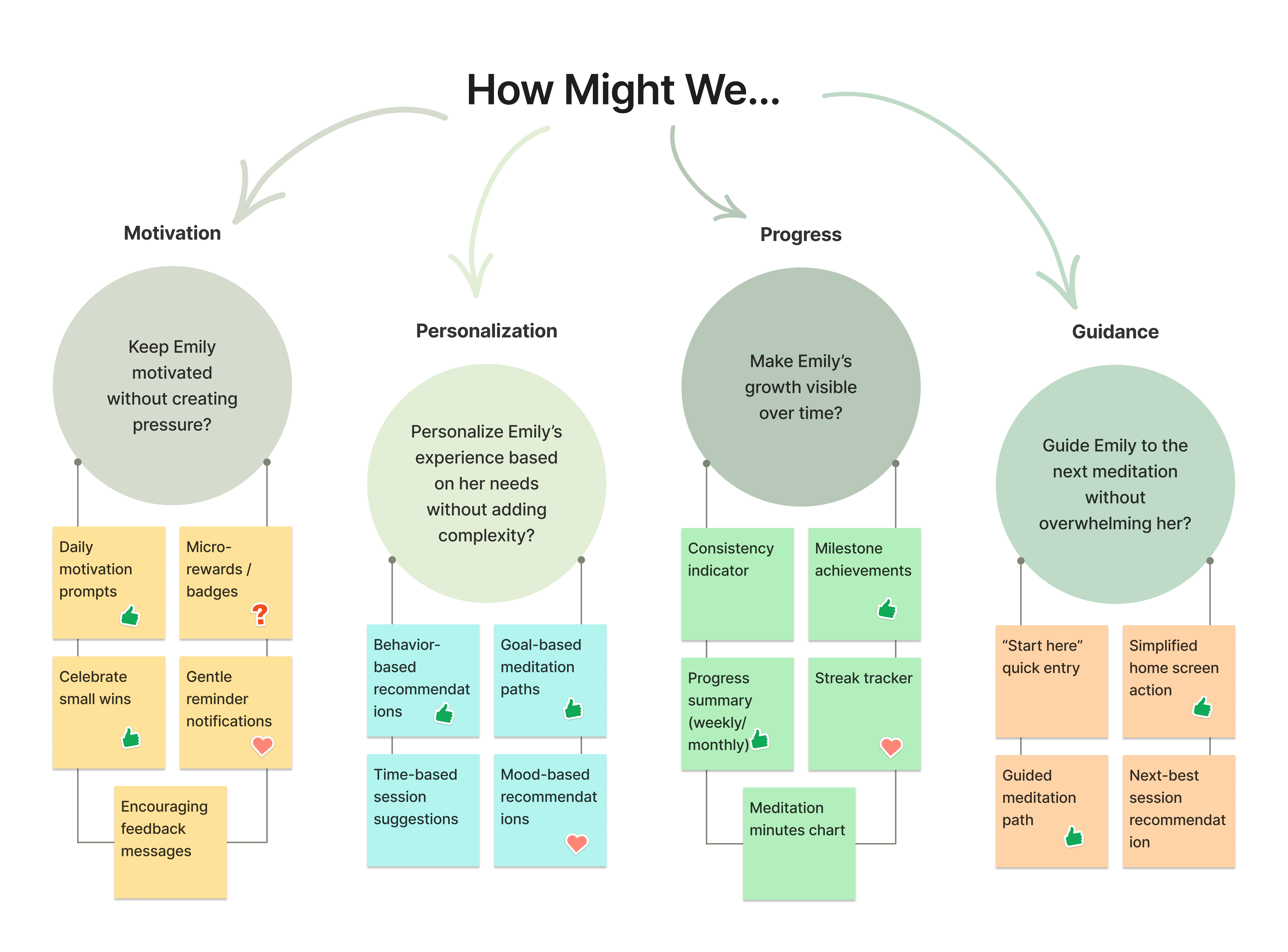
Research revealed a clear pattern: Users don’t struggle to start meditation, they struggle to stay consistent.
To transform these insights into actionable design directions, I reframed the main pain points as How Might We questions.
This helped shift the focus from problems to opportunities and guided the ideation process toward solutions that reduce overwhelm and support long-term engagement.
How did I turn research into actionable insights?
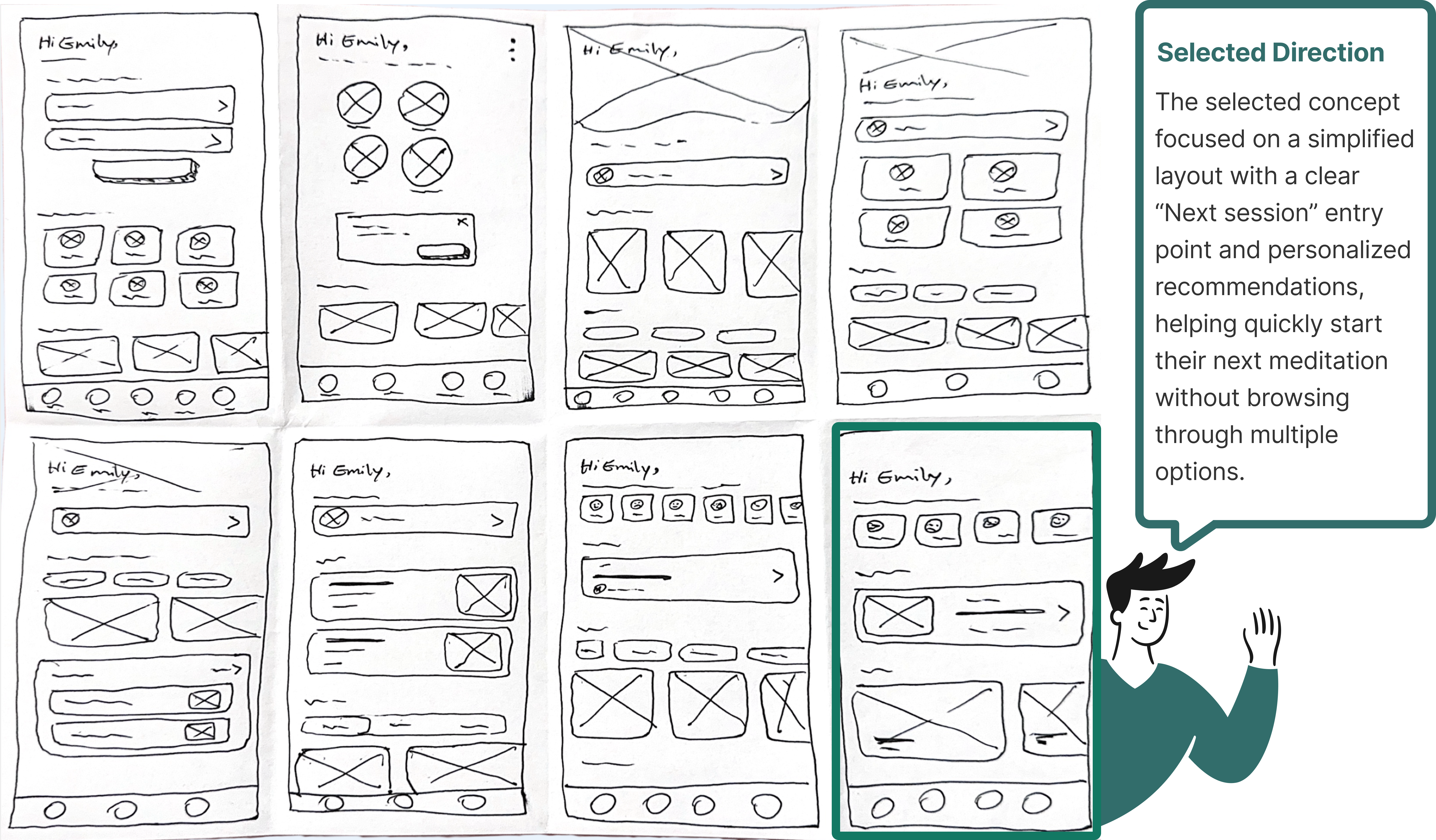
Exploring Multiple Homepage Concepts to Identify the Most Effective Structure.
To quickly explore different ways of structuring the homepage, I generated multiple layout variations focusing on content hierarchy, personalization, and clarity. This exercise helped me identify which patterns best supported user goals, particularly reducing overwhelm and guiding users toward a clear next action.
How did I turn research into actionable insights?
Simplifying the Path to a Personalized Meditation Experience.
To ensure a smooth and intuitive experience, I mapped out the key steps users take to create a personalized meditation session.
This helped identify decision points, potential friction, and opportunities to guide users toward completion, especially for returning users who need quick and effortless access.
The flow was designed to reduce cognitive load, minimize unnecessary steps, and reinforce a sense of progress and control.

How did I explore early layout directions?
Exploring Multiple Homepage Concepts to Identify the Most Effective Structure
To quickly explore different ways of structuring the homepage, I generated multiple layout variations focusing on content hierarchy, personalization, and clarity. This exercise helped me identify which patterns best supported user goals, particularly reducing overwhelm and guiding users toward a clear next action.
Rapid Homepage Explorations
How did I design a seamless user journey?
Simplifying the Path to a Personalized Meditation Experience
To ensure a smooth and intuitive experience, I mapped out the key steps users take to create a personalized meditation session.
This helped identify decision points, potential friction, and opportunities to guide users toward completion, especially for returning users who need quick and effortless access.
The flow was designed to reduce cognitive load, minimize unnecessary steps, and reinforce a sense of progress and control.

Above is the Task Flow & below is the user Flow
How did prototypes influence my design decisions?
Transforming usability issues into clearer, more motivating user experiences
In this phase, I translated usability testing insights into intentional design decisions, focusing on reducing cognitive load, improving clarity, and reinforcing user motivation. Each iteration was driven by real user challenges, ensuring the experience felt intuitive, supportive, and easy to follow.
How did I turn research into actionable insights?
Transforming usability issues into clearer, more motivating user experiences.
In this phase, I translated usability testing insights into intentional design decisions, focusing on reducing cognitive load, improving clarity, and reinforcing user motivation. Each iteration was driven by real user challenges, ensuring the experience felt intuitive, supportive, and easy to follow.

How did visual design decisions support a calming experience?
Shaping a Calm and Focused Visual Language
The visual design evolved through usability feedback and emotional response testing.
- We initially chose a mix of purples, turquoise, and green.
- Usability tests showed these colors felt too playful and not calming enough.
- Tried darker tones like deep purple and dark green, but users found them depressing.
How did I turn research into actionable insights?
Shaping a Calm and Focused Visual Language.
The visual design evolved through usability feedback and emotional response testing.
- We initially chose a mix of purples, turquoise, and green.
- Usability tests showed these colors felt too playful and not calming enough.
- Tried darker tones like deep purple and dark green, but users found them depressing.

Why Green?
- Inspired by nature, we switched to various shades of green.
- Green tones provide a sense of calm, balance, and a minimalist feel, aligning with our meditation app’s goal.
Typography
We chose the Poppins typeface for a friendly, modern feel and used a consistent icon set for harmony.
Aa
Poppins Medium 20pt
Poppins Medium 16pt
Poppins SemiBold 14pt
Poppins Regular 12pt

Color Accessibility
I also used the WebAIM Contrast Checker to ensure our colors meet accessibility standards.
- All combinations passed the required contrast ratios, with scores of 5.88:1 and 4.55:1.
- This ensures our design is clear and readable for everyone.


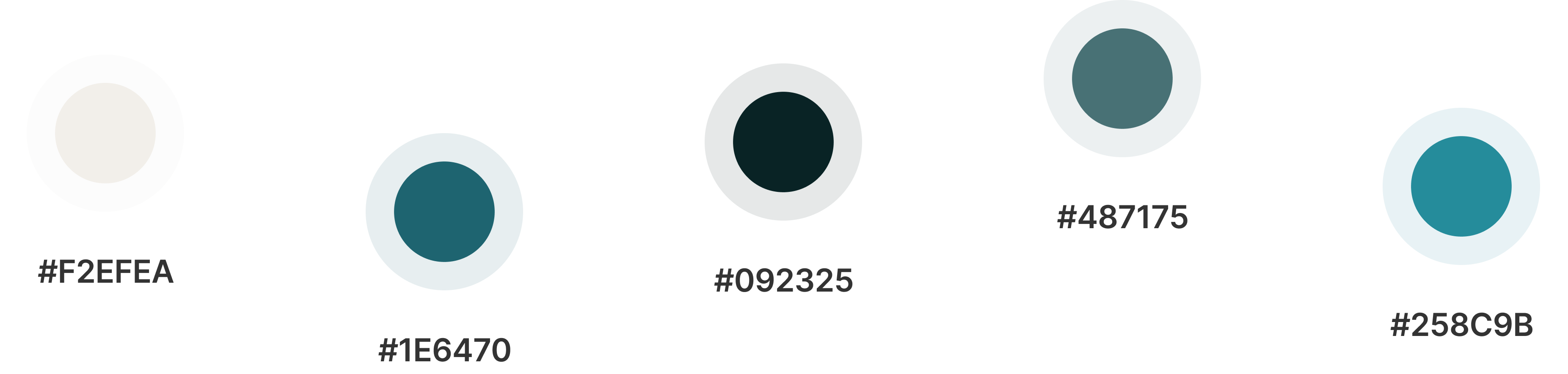
Our path to the perfect palette
- We initially chose a mix of purples, turquoise, and green.
- Usability tests showed these colors felt too playful and not calming enough.
- Tried darker tones like deep purple and dark green, but users found them depressing.


Why Green?
- Inspired by nature, we switched to various shades of green.
- Green tones provide a sense of calm, balance, and a minimalist feel, aligning with our meditation app’s goal.

#F2EFEA

#1E6470

#092325

#487175

#258C9B
Aa
Poppins Medium 20pt
Poppins Medium 16pt
Poppins SemiBold 14pt
Poppins Regular 12pt
Our UI Kit reflects the calming green tones from our mood board. We chose the Poppins typeface for a friendly, modern feel and used a consistent icon set for harmony.
Color Accessibility
I also used the WebAIM Contrast Checker to ensure our colors meet accessibility standards.
All combinations passed the required contrast ratios, with scores of 5.88:1 and 4.55:1.
This ensures our design is clear and readable for everyone.
How did I turn research into actionable insights?
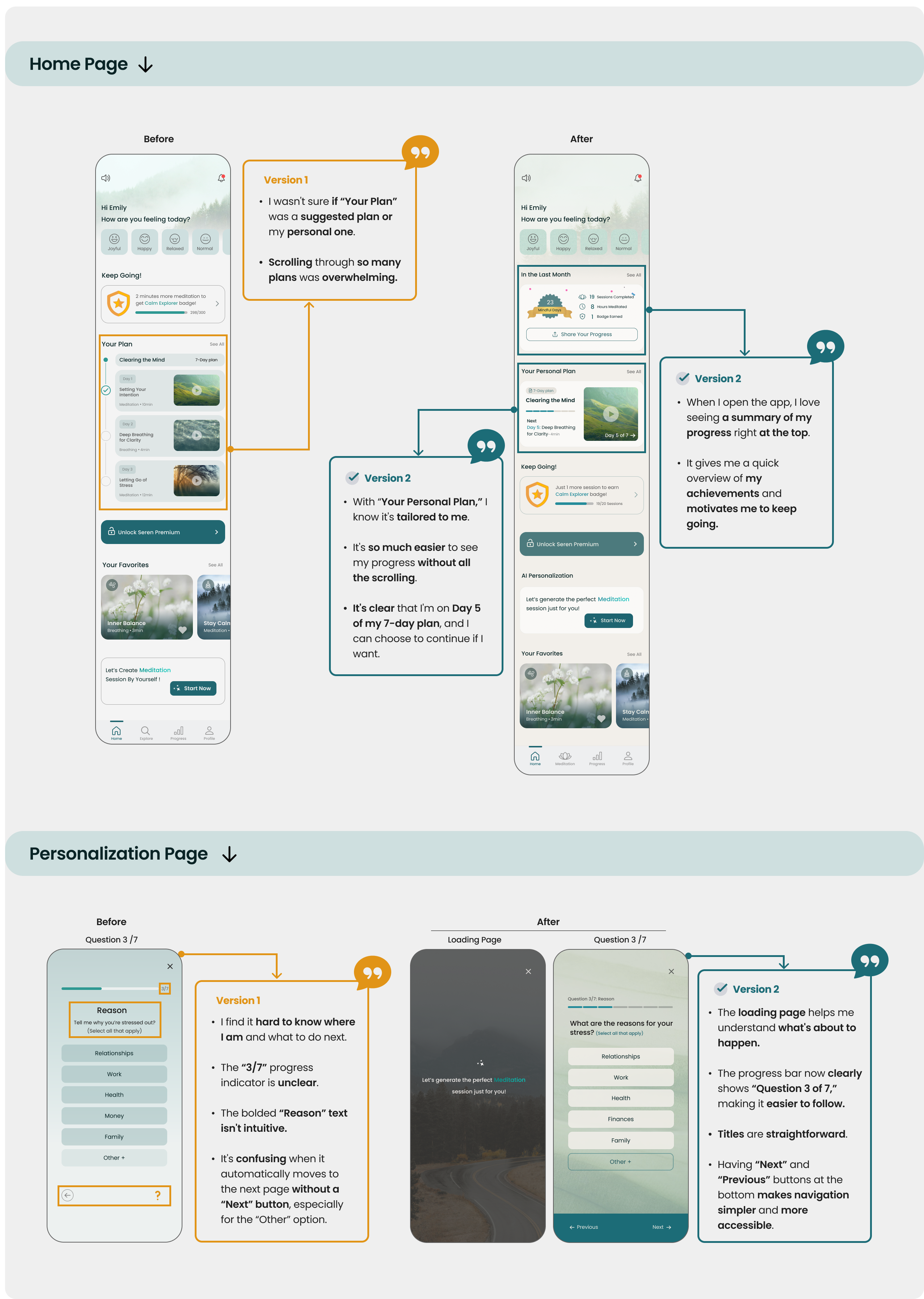
Usability testing revealed that users felt uncertain, overwhelmed, and lacked clarity when navigating their progress and personalized plans.
I focused on simplifying the experience by improving progress visibility, content hierarchy, and decision clarity, leading to a more intuitive and motivating user journey.
What changed after usability testing?
Usability testing revealed that users felt uncertain, overwhelmed, and lacked clarity when navigating their progress and personalized plans.
I focused on simplifying the experience by improving progress visibility, content hierarchy, and decision clarity, leading to a more intuitive and motivating user journey.

How did I turn research into actionable insights?
The final design focuses on reducing cognitive load and guiding users toward consistent meditation habits.
By introducing clear progress visibility, personalized pathways, and simplified navigation, the experience helps users understand what to do next and feel motivated to continue.
These design decisions directly address earlier pain points around overwhelm, lack of direction, and low engagement.
How does the final design improve user retention and clarity?
The final design focuses on reducing cognitive load and guiding users toward consistent meditation habits.
By introducing clear progress visibility, personalized pathways, and simplified navigation, the experience helps users understand what to do next and feel motivated to continue.
These design decisions directly address earlier pain points around overwhelm, lack of direction, and low engagement.


Reflection
Learning from the Project Journey
What did I learn?
Working on this project emphasized the importance of clear team communication and early feedback.
Starting with a strong design foundation made iterations smoother and more efficient.
What can I do next?
Conduct additional usability tests to refine this version and incorporate more feedback.
Ensure accessibility by testing with diverse user groups and incorporating features like voice guidance and adjustable font sizes.
Figma Prototype
Thank you for making it this far!
How did I turn research into actionable insights?
Thank you for making it this far!